
iOCBC | Helping retail investor to be an aspiring retail trader
2010 was a significant year for OCBC Bank. That year marked OCBC as one of the first banks in the region to set up an Experience Design team as it began its transformation journey focusing on Customer Centricity.

Problems to solve
In 2012, OCBC Securities, a wholly owned subsidiary of OCBC Group, is faceing strong competition from both local and international brokerage houses in Singapore. Competitors are offering lower fees, more service options and more robust trading systems. The business approached us with the primary objective of redesigning a new trading platform and to create a great online trading experience for their customers. I am tasked to deliver key experience flow to our business partner within 3 months to support their business case submission. The combination of an aggressive timeline meant I needed to identify the key risks, problems to solve first before getting the experience right.


My Role
I led and is responsible for the experience strategy, design and research of OCBC Securities trading platform redesign across tablet, iOS, Android and web since the outset of the project in March 2012. I lead the UX work, producing all major research works, journeys, wire flows and key interactions and present these to the management. The business case was submitted and was put on pause due to huge investment projected to develop. The work was executed in 2019-2020 post my departure from OCBC Bank. The platform is currently on beta testing and opened to invited customers only.
I worked alongside 1 UX Architect, 1 UI designer , from a design agency in the detailed wire design stage and later an internal Interaction designer for setting up and enhancing layout grids and visuals refinement.
My work covers the following areas:
- Customer research, insights & ideation
- Experience strategy and vision
- Planning and scope definition
- Leadership
THE CHALLENGE
Getting clarity on our customers and creating greater value for them
OCBC Securities would offer a multi-assets trading platform, and bundled features. Businesses communicated their target customers were anyone that trades in Singapore. There was a lack of data on who the customers were and how they trade. This made it hard to set clear design goals for the experience and run the experience risks of serving no one well at all.
The challenges were
- To get clarity exactly who our customers were; from transactional to behavior traits.
- To discover if early assumptions that a multi-assets, bundled options were attractive value propositions to existing customers
- Create an experience that can evolve with customers and help OCBC Securities to be one of the top brokerage houses in the highly competitive brokerage segment in Singapore.

DISCOVERY
The Approach
My lack of domain knowledge in trading meant I needed to understand the world of trading from a systems perspective as well from customer’s perspective
To gain a deeper understanding of our customers l want to know
- Who was trading with us?
- Why do they choose to trade with us?
- What is their point of view on ours and competitors' platforms?
- What is their initial reaction to proposed business ideas?
Knowing our customers first
Together with the help of business owner and market researcher, we looked at customer service tickets and transaction data to identify and grouped customers into segments. We learnt that 1% of their customers made up of 90% of trade volume. This proved to be a major finding as it anchored the project in target customers to serve as well as the primary users I am designing for.
We learnt that 1% of their customers made up of 90% of trade volume

Early insights
The earlier customer segment analysis helped me to group the customers mainly into two main groups - Investor and traders. Interviews were conducted for a deeper dive. We see a clear difference in mindset, attitude, behaviors, service needs and expectations between the two segments.

Same same but different different
We talk to customers to get deeper into understanding of investors (retail) and trader's field to understand how to better design for two vastly different user segments.

Different archetypes have both similar and different needs. For example both a newbie and seasoned trader uses fundamental information like Company information and PE Ratio however the understanding and depth of information they looked for are different

" Steep learning curve."
Retail customers who trade frequently and has strong interests to take their game further often find trading systems are either too basic (great for investors but not for them) or too complex (for professional full time traders).
"We don't choose brokerage house, we choose brokers"
Customers has demonstrate high stickiness and trust in high performing brokers means the platform can move beyond a transactional platform into a servicing platform.
People care about goals NOT Features
From both our interviews and customer service tickets we see a common pattern and learnt that customers care about ease of accomplishing their goals more than features.

Need for information timeliness
- All users had a thirst for immediate information especially price changes, or related news that can move the markets or its stocks. Relevant alerts are one of the most important tools to help them in their goals. Currently useful information such as trading curbs were not announced on the platform.
Ease of use of platform can shorten the learning curve on trading for aspiring traders
- The lack of platform feedback makes trading stressful for newbies. For a newbie, the learning curve is steep while for a seasoned trader any system, glitches cause him/her to lose an opportunity to make money. Hence a platform that provides prompt guidance, help and support when needed will be a winner.
Friction points to making a trade is a big no for traders
- There were many examples of friction points in the current platform’s user experience. There were pop outs everywhere. From login screen to order screen to counter information screen. To make a trade, the platform requires users to have and remember 2 passwords. There are login and trading passwords. It became an issue as retrieving the password was not instant. Certain stock counters allow certain payment types, such logics are not built into the ordering system, allowing traders to submit orders only to be rejected later.
Fundamental difference between what we think customers want and what they care
To validate the internal customer value hypothesis, I ran co-creation workshops with frontliners and customers and stack-ranked the solutions from perceived value perspective. I was surprised by the huge gap between what customers really care about and what we want to build. This indicated there was more work to be done before the team could submit business case proposal.


Based on the insights gathered, I worked together with the BO to define what the to-be experience should focus on and plan for redesigning the requirements by working backwards from customers. Design principles framework helped to create visibility into my decision process and help the team to align in a common vision

DEEPER INSIGHTS
Working backwards from customers
The previous process had taught the team to be customer data driven. With the help of BO, we dug further into the customer tickets. 59% of customer’s complaints were on the reliability of the system such as orders discrepancy, system was down, price feed was not accurate or timely.
I interviewed more customers for a more complete picture of our customer base, covering foreign markets’ traders, more high value traders across different life stages.

Opened multiple windows & tabs forgotten
Beside system performance and reliability, how easy, fast to make a trade helps in a Trader’s trading process. It was commonly observed they used multiple monitors or multiple tabs or windows open yet at the same time Traders got confused and lost track of where they were. The back and forth motion to watch overview and back to stock detail was repeated in all traders. To make matters worse, the platform uses pop up window heavily which add ons to the proliferation of opened tabs or windows.

Some zeros just don’t make sense
Zeros appear in many places in the financial world. From portfolio value, to prices to the quantity of trade. Each market minimum qty can be different. Example in Hong Kong’s stock Market, the minimum quantity is usually 100. Im Singapore, the minimum quantity is 1000.
This can result in human errors that can be costly to the Traders. In addition, if the standard size 1000, it might not make sense to create the additional friction on entering the 3 zeros.

Usability issues are common and high density screen does not support quick glances
The visual design of the majority of trading platforms in singapore looks the same and had a low bar on good visuals hierarchy, information design and less so on supporting trader’s task such as visual scan.

Triangulation leads to confidence
Before I could head straight to designing, I led the triangulation of insights from our internal User Research data and external market research reports (Investment Trends). The triangulation exercise demonstrated that smaller sampling size can have the same findings yet yield more insightful details that a large sampling survey cannot. The exercise lead to confidence in our research methodologies.
HOW WE GOT THERE
Reframing the problem
The instability of the platform amplifies the formation of a poor user experience for the Traders. Poor user experience consists of high friction logins, multiple pop outs, poor visual hierarchy, information design, navigation, limited content (trading) and jargon leads to confusion and missed opportunities for seasoned traders and a steep learning curve for retail investors.
How might we help trader in making better trading decisions?
From the interviews with trader and trader-to-be, a common emotional aspiration is the desire to be better at every trade . That begged the question “what is the role of our platform in their trading journey?”
I mapped out the current trading journey where login, researching, monitoring and execution stage were identified as low points. The start of the trading or investment ideation stage to execution is where the two distinct customer archetypes differ in how and what they get there. This proved to the team that the previous push for business to be articulative of customers to serve was the right one.
Start with the basic
Layout was one of the areas identified that requires rethinking. That begged the question: how might we help trader to monitor price movement easily at one glance while allowing trader to zoom in and out of specific stock details and functionality with minimum friction.
The journey mapping helped the team to focus on areas that required most attention. There were:
- Content hierarchy and information design
- Layout to support overall trading efficiency and speed
- Key moments - Modules that support key moments in the journey like monitoring, execution, help (online and offline) experience
Content simplicity drive speed
Content hierarchy in this context means
- (sitemap like menu, navigation pathways)
- Information design and density
I relooked at menu accessibility based on the following criteria
- Frequency of use by traders on daily/weekly basis
- Content similarity and relevance (Grouping technique)
- Existing depth (level)
The current hierarchy had a level depth from 2 to 6 and these exclude pop-ups. The goal was to reduce the level to an average number of 2 for high frequency user tasks via layout and interaction design. Reducing deep hierarchies to a minimum.

Desktop was the preferred device used in trading with mobile use cases on-the-go. Most time was spent on the desktop platform. The challenge was the top bar content was fixed and there was a lot of content and features required by Business to be displayed. I also knew I did not have the time to pivot, hence decided to focus on cleaning the menu to an average level of 2. I explored how the menu can be scalable for future use. There are 3 types of menu content. Namely Single, double and deep tiers (more than 2). The design goal was to ensure Traders know where they are and where they came from.

Just trade and leave the rest to us
From observation and interviews, I understood that during “active” trading, the trader was passive while the markets were moving. Meaning Traders either acted according to trading plan (pre-market opening) or responded to market movements. Majority of the time the trader does nothing until signals come in. I explored possible layouts that can support this active and passive interactions while having scalability across desktop, tablet to mobile in mind.

This drove my design to enable ease of monitoring for trader, while supporting immediate action with just one click. The idea was to create a passive and active space (panels). One that allows overview, another allows detailed view within the same screen.


Glance- ability
Traders check order status, fill quantity and price points when a trade was executed. Current platform did not differentiate the hierarchy of information needs of the trader. The design goal is to focus on key, primary information that informs traders so they can make quick and smart decisions immediately. Secondary information are hidden and make available by a click away.


The need for speed
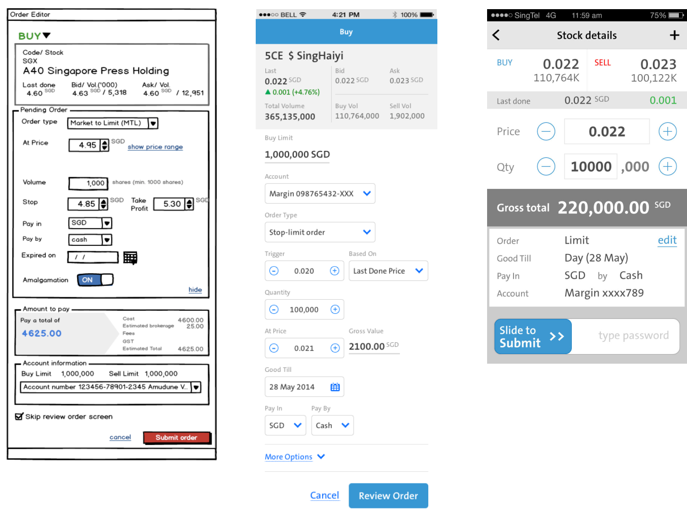
As I spoke to more traders, I grew to understand their desire for speed and how existing platform design created unnecessary steps from their point of view. This realisation created a desire in me to design a simpler ordering screen for the traders at their critical moment. The buy/sell action screen requires the most inputs by Traders, and in irony, is the one where Trader wishes it to be the fastest.

I looked into simplifying the design. Areas that I looked at were the screen density (information density), the criticality of each form input we asked for Traders.
- Only key information are shown
- Fields that do not change often are pre-filled or hidden
- Reducing submission of trade from 3 steps into 1 by combining password and submission intop 1 step

After thoughts
The business team submitted the business case for tender submission however it was decided to put it on hold. On reflection, the business got a clear customer target, experience strategy and tactics. We moved from guessing to knowing, we got vague requirements to clear requirements.


Update 2019-2021
I left OCBC Bank in 2016. The business paper and initiative was reactivated sometime in 2019. It seems that the majority of the work went into production. The new app was launched in Sept 2021.
